How to Increase Conversions on Your Website

You’ve done the work — built the site, written the content, followed the advice — and yet something still feels off. Before you tear it all down, here’s 6 easy fixes that most people miss when it comes to how to get more website sales, aka convert more window shoppers into buyers, aka more dolla bills in the bank. (fake countdown timers not required)
1 // Price Check on Aisle 3
This is such a controversial issue! One I see hotly debated on social media at least once a week. But (gladly) the general consensus agrees with me: browsers are swiftly clicking OFF of service providers websites if they have to fill out a form / send an email to get pricing info.
THE FIX: If you don't want to air all your pricing laundry, at the very least put a ‘starting from’ price. If you do custom quotes, you can give an example or two, something that gives people a ballpark of what to expect when they enquire / book a call with you.
Pricing transparency builds trust, attracts the right enquiries, repels the wrong enquiries, & saves everyone time. So, pretty please, put your dang pricing on your website.
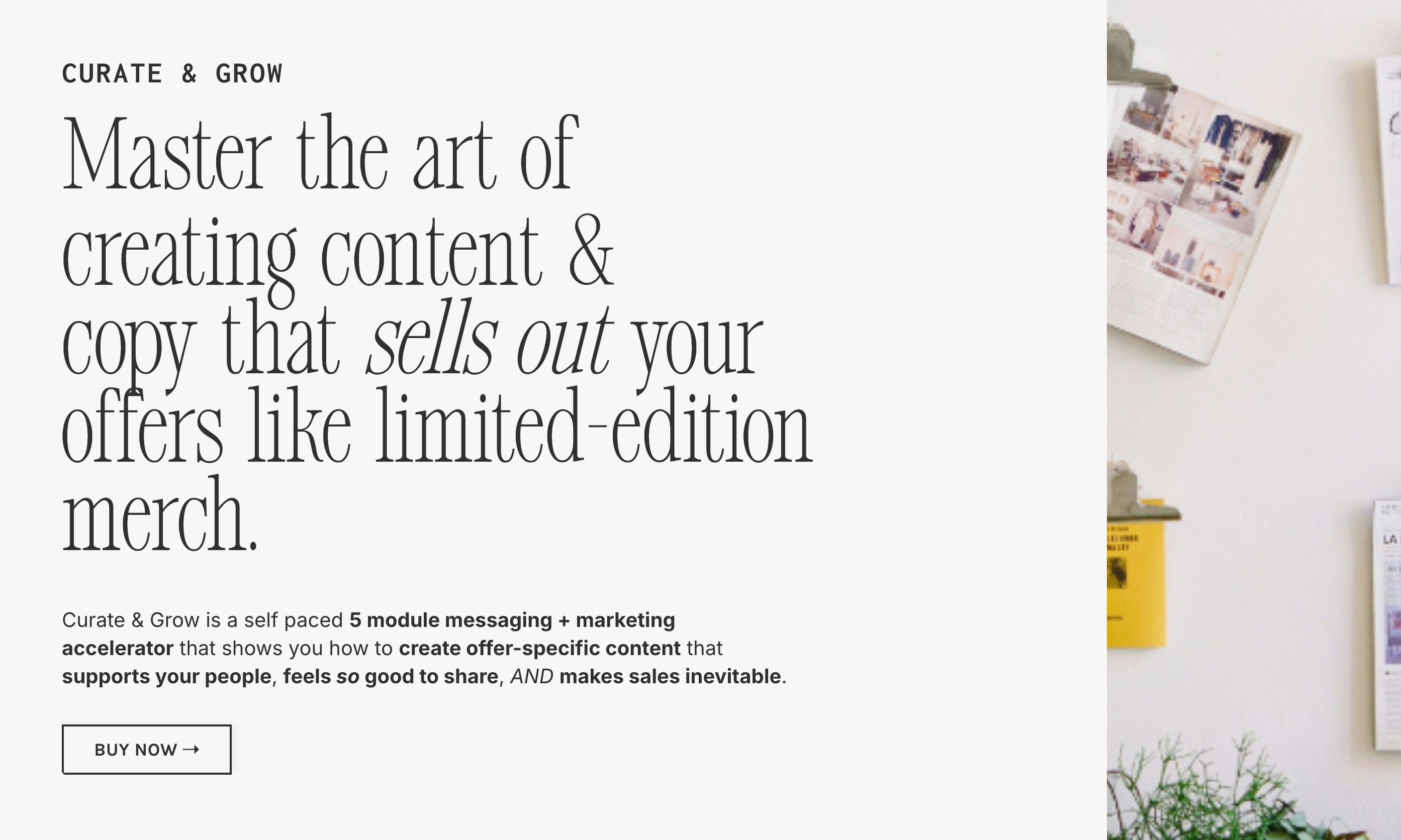
2 // Prime Real Estate = Prime Copy
80% of people will mostly skim the headings on a website (gasp!), so it's an excellent idea to make the most of that prime heading real estate.
THE FIX: Don’t waste that prime headline real estate on the obvious stuff.
Example: 'Curate & Grow' is the eyebrow copy, and 'Master the art of creating content & copy that sells out your offers like limited edition merch' is the headline copy.
Which means the part that's going to really stand out to the reader is the transformation / outcome / result of the program.
And it's not just standing out because it's literally a much bigger font...it's standing out because us humans have always got one question in the back of our minds when we're reading: "What's in it for ME?".
3 // Exhibit A (and b, c, d, e)
Every website and sales page needs PROOF. Testimonials, reviews, social proof, all the proof, because PROOF BUILDS TRUST quicker than pretty much anything else.
Proof says to the reader "Yes! Someone has already tried this thing and had success with it!". Which immediately skips that reader ahead in the Stages of Awareness...because it reduces some (or a lot) of the risk factor.
THE FIX: I love a blend of screenshots & testimonials, BUT the most impactful way to showcase them is when they specifically speak to the before & after of working with you...NOT just praising how much of an awesome person you are.
This tells them that they'll likely get the outcome / result / transformation they're looking for if they choose you.
4 // CTA Buttons Aplenty
We don’t want your people scrolllllling for days until they find a button. Maybe it’s not the first time they’re visiting the page, or maybe they’re impatient.
Either way, here's your permission to stop thinking it's pushy and salesy to have more than a couple of CTA's buried two thirds down the page. Truth is: it's helpful! MAKE IT EASY for them to get where they want to go, and / or get what they need.
THE FIX: Put a CTA button above the fold (annnnd most other places).
5 // Services Page Glow Up
This page isn't meant to be a bullet point list of deliverables, or give takeout menu vibes. THIS PAGE has the most revenue generating potential on your website.
THE FIX: Services pages (and sales pages) should have a flow that feels easy and helpful, like a conversation. Some pages / offers will suit having more details than others, but at the very least the flow can go like this:
A) Acknowledge what they might be struggling / challenged with (get specific!),
B) then talk about what the opposite scenario looks like (again, specific!),
C) then bridge the gap by introducing your offer/s.
6 // Personality + Strategy Driven Copy
Conversational + strategic website copy is the ultimate combination.
Conversational copy with a personality will give your people ALL the feel good vibes, which means that they'll form a lovely lil' association with your brand AND it means they’ll still be thinking about how cool you are long after they’ve moved on to their other 23 tabs.
Strategic website copy means that your words aren't just nice to read, they use buyer psychology to intentionally guide the reader and help them to make a buying decision that's right for them.
THE FIX: Book me, lol. (but seriously)
TL;DR → Make it easy for people to buy from you!
Imagine spending less time worrying about the dismal reach on your latest reel, because you 100% know that your website is working it's ass off for you (while you're out there living your literal life)?
Here’s how I can help you replace that social media content hamster wheel with a good book & a warm blanket:
>> Grab my free copywriting pack to Book Your Next Client! 3 days of frameworks, prompts, & scripts (strategic, personality driven, & from a copywriter - hi!) that'll stop you scrambling for the right words, & get you taking action.
>> Have me audit your website and make sure that all of your pages are *completely perfect*, without having to redo the whole thing or restart from scratch.
>> Check out my copywriting services and have me write (and SEO optimise) your entire website for you, so you can worry about actually delivering your services while I ensure they’re getting the attention they deserve.
To get in touch with me, send me a DM or email me at [email protected]!